LearnUp Portal
An EdTech platform that works as well on a cracked phone screen as a laptop.
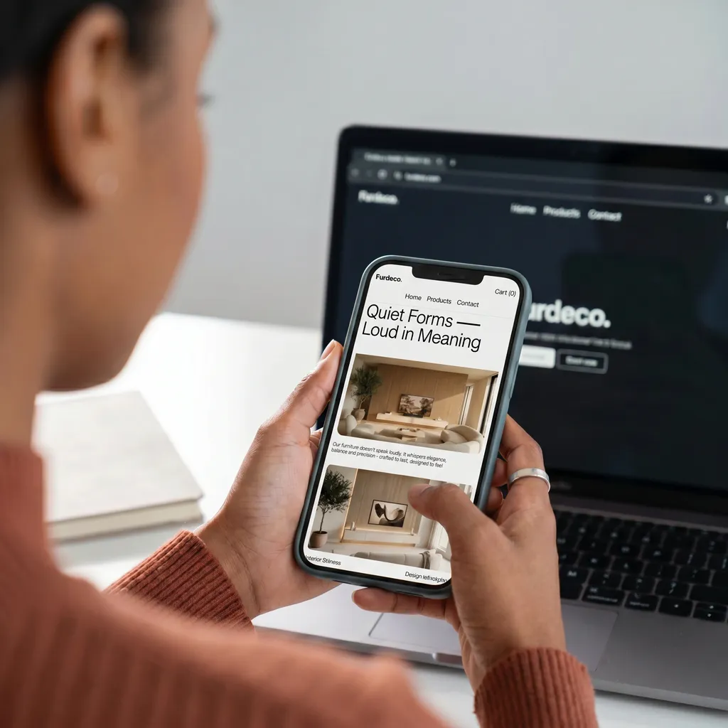
LearnUp's learners are overwhelmingly on mobile, often on lower-end devices and inconsistent connections, a very different constraint than the fast office wifi and current-generation hardware most platforms get designed and demoed on. The platform had to be genuinely lightweight, not just responsive in name.
A lot of EdTech UI is designed on a desktop and shrunk down as an afterthought, which shows up as tiny tap targets sized for a mouse cursor, not a fingertip, and video-heavy pages that stall or fail outright on a weak connection. That approach wasn't viable for LearnUp's actual audience, where a lesson that doesn't load in a few seconds on patchy mobile data is a lesson that doesn't get finished.
We designed mobile-first from the first wireframe rather than adapting a desktop layout down, sized every tap target for a real thumb on a real screen, and prioritized text and lightweight assets over heavy media wherever it didn't hurt the learning experience: video where video genuinely teaches better, plain content everywhere else. The component system was built and tested against throttled, low-bandwidth conditions from the start, not patched in afterward, so pages stay legible and fast even on modest hardware and inconsistent signal.
A learning portal that performs consistently for the students actually using it, on the phones and connections they actually have, not just in a demo on a fast office connection.
Let’s build something memorable.
PayMoment
A checkout flow engineered to lose zero customers to friction.