Bronze Wellness
A wellness platform that feels calm before you've even logged in.
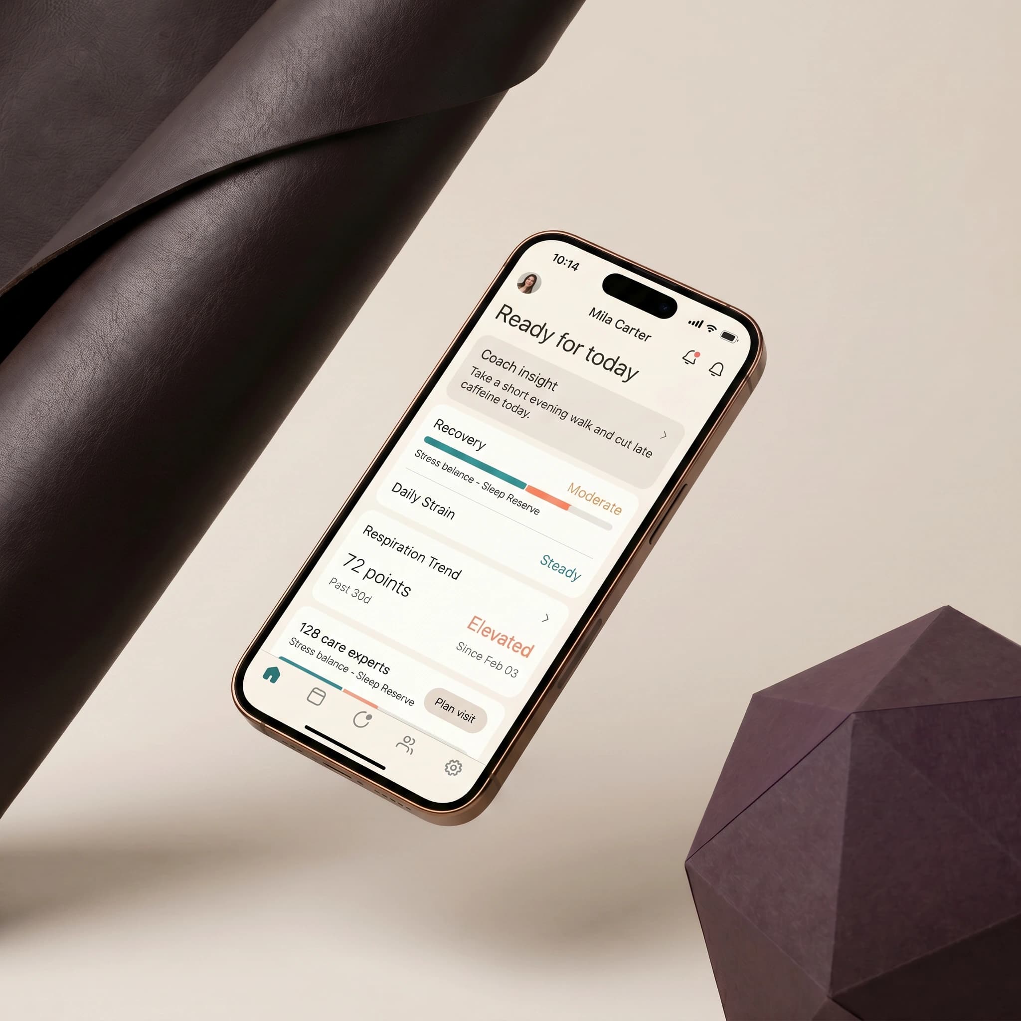
Bronze Wellness came to us with a strong concept, personalized wellness programs, and a platform that didn't yet feel like a wellness brand. The interface was functional, but functional isn't the same as calming, and the gap between the two was showing up in how far people got through onboarding before dropping off.
Wellness products live or die on trust and tone. Clinical, cluttered interfaces make people anxious rather than at ease, which works against the entire premise of a wellness platform. The existing flow front-loaded every form field and program option on a single screen, asking for commitment before earning any. Bronze Wellness needed an experience that felt considered at every step, from onboarding to daily use, not just a redesigned skin over the same structure.
We paired a soft, restrained visual language (muted tones, generous negative space, typography sized for reading at arm's length rather than scanning) with a strategy pass on how the platform introduces itself: what it asks first, how much it explains before asking anything at all, and where it gets out of the user's way entirely. The web experience was built mobile-first, since that's where most sessions happen, with onboarding broken into short, single-decision steps instead of one long form, and motion tuned to ease transitions rather than announce them.
A platform that reads as considered rather than clinical at every touchpoint, built to support a daily habit, not just a signup, with an onboarding sequence that gives people room to arrive at their own pace instead of demanding it upfront.
Let’s build something memorable.
Fazn Studio
An editorial identity for a brand that outgrew its old logo.